
PAGOSeduc is a payment platform designed specifically for educational institutions, providing solutions to streamline administrative tasks and ensure timely fee collections through automated processes.
ReBranding
Prelinary research
Through our research, we identified the need for a rebranding, both for the platform and its overall identity. We explored positive elements of the existing brand while also uncovering key areas for improvement.
The main objective was to build an identity that reflected the commitment to constant development in the field of sports surfaces, while also connecting with the earth, representing the solid and reliable foundation on which the brand's solutions are built.
From the existing brand, we preserved two essential elements
Checkmark = Symbolizing the platform’s efficiency and reliability.
The Fan Icon = Representing the wide range of payment options the platform offers.

Platform
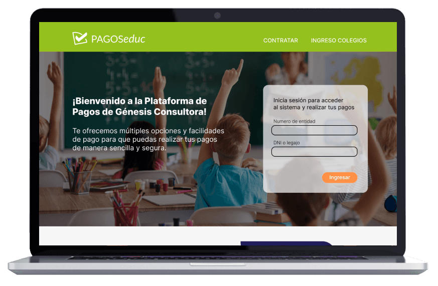
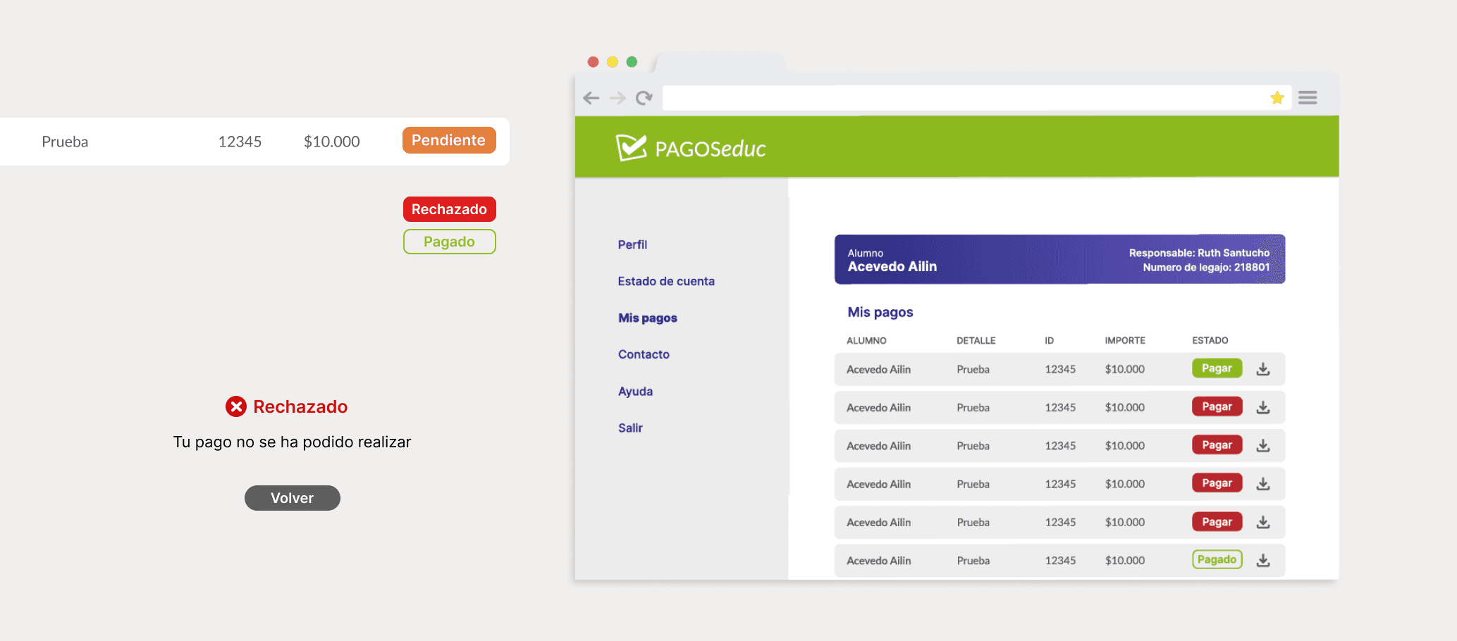
PAGOSeduc is built to simplify the payment process for both parents and institutions. The redesign focused on improving usability, enhancing the user experience, and reinforcing trust and security in financial transactions.

The primary objective of the website redesign was to ensure that every interaction with the platform was intuitive and efficient. This meant simplifying navigation, streamlining the payment process, and enhancing the visual clarity, all while transmitting a sense of financial security to users.


Campaign
To communicate the platform’s new functionalities and benefits, I designed a multi-channel promotional campaign. The campaign ensured that the institutions reached their audience effectively, highlighting the platform's improvements and new features.

